
Ever feel like your marketing is a one-way street?
You put out great content, but visitors just cruise on by. That’s where powerful CTAs (Calls to Action) come in. Think of them as irresistible invitations, nudges toward engagement that turn window shoppers into raving fans.
In this article, we’ll explore powerful CTA examples and show you how to craft CTAs that convert like crazy.
Table of contents
- What is a Call to Action?
- How to Write CTAs That Get Results
- 9 Tips for Better Call To Actions
- Designing Your CTAs for Maximum Impact
- Beyond Clicks: Call to Action Success Metrics
- 7 Landing Page CTA Examples for Higher Engagement
- 7 Call to Action Examples for Emails with High CTR
- 7 CTA Examples to Boost Your Ad Conversion Rates
- 1. Google Ads CTAs: Use Urgency and Specificity
- 2. Facebook Ads Call to Actions Examples
- 3. Instagram Ads CTAs: Highlight Aesthetics and Exclusivity
- 4. TikTok Ads Call to Action Examples
- 5. Twitter (X) Ads CTAs: Promote Engagement and Conversation
- 6. LinkedIn Ads CTA Examples
- 7. Pinterest Ads CTAs: Encourage Exploration and Inspiration
- Frequently Asked Questions About CTAs
What is a Call to Action?
A Call to Action, commonly referred to as a CTA, is a directive used in marketing materials that prompts the audience to perform a specific action. This action can vary widely from subscribing to a newsletter, making a purchase, or learning more about a product. CTAs convert visitors to leads or customers, key in the marketing funnel.
Imagine this: you’ve crafted a blog post that explodes common fitness myths. You want readers to take the next step, maybe download your free workout guide. A weak CTA like “Learn More” might leave them shrugging. But a compelling one like “Unleash Your Inner Athlete: Download Your Free Workout Guide Now!” sparks action.
The Role of CTAs in Digital Marketing
In digital marketing, CTAs guide users through the buyer’s journey, from awareness to purchase. They are the tipping point between bounce and conversion, acting as signposts that guide users on what to do next. Effective CTAs boost engagement and conversion on websites, emails, and social media.
The general conversion rate for web pages stands at about 2.4%, with top performers reaching rates above 11.5%. This demonstrates the broad spectrum of CTA effectiveness across different sites.
By clearly stating what the audience will get by taking the next step, CTAs help eliminate ambiguity and make the decision-making process easier for potential customers. Moreover, they’re a key metric for measuring the effectiveness of various marketing strategies, providing insights into what appeals to the audience and what doesn’t. Through careful wording, design, and placement, CTAs can dramatically influence the success of digital marketing efforts, making them indispensable tools for marketers aiming to achieve specific business objectives.
How to Write CTAs That Get Results
Forget “click here” and boring banners. Effective CTAs (Call to Actions) are more than just eye candy. They’re the secret sauce that transforms website visitors into engaged participants and drives conversions.
The key lies in understanding your audience and what motivates them. What are their hopes, fears, and desires? What information or resources would they find most valuable? Once you know what drives them, you can craft CTAs that speak directly to their needs and aspirations.
For example, imagine a website visitor who just devoured your blog post on 5 tips to improve your sleep quality. A bland CTA might leave them unsure of the next step. But a compelling one, like “Sleep Better Tonight: Start Your Free 7-Day Sleep Challenge Now!”, speaks directly to their desire for better sleep and offers a tangible solution.
By crafting CTAs that are relevant, specific, and benefit-driven, you can motivate your audience to take action. Whether it’s signing up for your newsletter, downloading a free guide, or making a purchase, clear and compelling CTAs guide them along the buyer’s journey and help you achieve your marketing goals.
Don’t underestimate the power of CTAs. CTAs, with effort and understanding, become powerful tools to enhance website performance and success.
Key Elements of an Effective CTA
Clarity: Your CTA must be clear and concise. Users should understand exactly what action you want them to take. Phrases like “Shop Now” or “Get Started” leave no room for ambiguity.
“Download Now” for a digital eBook. This CTA ensures clarity; upon clicking, users start downloading an eBook immediately.
Urgency: Creating a sense of urgency encourages users to act quickly. Words like “Today Only” or “Limited Offer” trigger a fear of missing out (FOMO), pushing them towards immediate action.
“Sale Ends Midnight!” for an online store’s limited-time offer. This CTA creates a sense of urgency, pushing the shopper to make a purchase before the offer expires, leveraging the fear of missing out on a deal.
Value Proposition: Highlight the benefit that users will receive upon clicking. Whether it’s access to exclusive content, a free trial, or a discount, make the value clear and compelling.
“Start Your Free Trial” for a subscription service: This CTA promotes trying the service without obligation, showing users they can explore it for free.
Visibility: CTAs should stand out visually. Using contrasting colors and placing them in easily noticeable positions on your page ensures they don’t get overlooked.
A “Sign Up” button in bright orange on a website with a blue background. The contrasting colors ensure the CTA catches the user’s eye, making it hard to miss and more likely to be clicked.
Action-Oriented Language: Use verbs that inspire action, such as “Discover,” “Join,” or “Subscribe.” Active language energizes your CTAs and makes them more clickable.
“Discover Your Best Self” for a personal development course. Using the verb “Discover” not only encourages action but also suggests a transformative benefit, making the CTA more appealing and clickable.
The Psychology Behind CTAs: What Makes Them Click?
Understanding the psychological triggers that encourage users to click on your CTA can significantly increase your conversion rates. Here are a couple of insights:
Decision Paralysis: Too many options can overwhelm users. A single, clear CTA reduces hesitation and guides them towards the desired action.
Emotional Connection: CTAs that evoke an emotional response are more effective. Whether it’s the excitement of trying something new or the satisfaction of solving a problem, tapping into emotions can motivate users to click.
Social Proof: Including elements of social proof, like testimonials or user counts (“Join 10,000+ Subscribers!”), reassures users that they’re making a popular and validated choice.
9 Tips for Better Call To Actions
Personalize Your CTAs: Tailored CTAs that align with the user’s previous interactions or demographic information can significantly boost engagement. Personalized CTAs have been shown to perform 202% better than generic ones. Personalization can increase CTA performance by 202%.
Use Action-Oriented Language: Start your CTA with a verb that encourages action. Words like “Download,” “Subscribe,” “Learn,” and “Get” can make your CTA more compelling.
Create a Sense of Urgency: Using time-sensitive language can make users act quickly. Phrases like “Limited Time Offer,” “Today Only,” or “While Supplies Last” can increase the effectiveness of your CTAs.
Make It Visually Striking: The color, size, and placement of your CTA button can dramatically affect its visibility and click-through rate. Opt for contrasting colors and ensure it’s large enough to be noticed without overwhelming the content.
Keep It Concise: Your CTA should be brief and to the point. A short, clear message is more likely to grab attention and get clicked.
Highlight the Benefit: Let users know what they’ll gain by clicking on your CTA. Whether it’s access to exclusive content, a free trial, or a valuable resource, the benefit should be clear and enticing.
Ensure Relevance: Make sure your CTA is relevant to the content it’s associated with and the stage of the customer journey the user is currently in. This relevance ensures that the CTA feels like a natural next step for the user.
Use Trust Signals: Including social proof, such as testimonials or user counts, next to your CTA can increase trust and encourage clicks. Security badges also reassure users about the safety of their data.
Consider the Welcome Gate: Placing CTAs in the welcome gate (the first thing users see when they visit your site) can yield higher click-through rates than other locations on your webpage.
Designing Your CTAs for Maximum Impact
Designing CTAs for maximum impact involves thoughtful consideration of both their design and placement, as well as the psychology of color. Effective call to actions are not just buttons to be clicked; they’re strategic tools that guide users towards a desired action, significantly influencing conversion rates.

The Importance of Design and Placement: A well-designed CTA stands out visually while fitting seamlessly within the overall design of the page. Its placement should be intuitive, where users naturally focus their attention. For instance, placing a CTA “above the fold” ensures it’s seen without scrolling, increasing visibility and action rates. Equally, aligning CTAs with the user’s line of sight as per the website’s content flow can enhance engagement. A/B testing different designs and locations can reveal what works best for your audience, striking the right balance between prominence and subtlety.
Color Psychology and CTA Design: Color plays a pivotal role in CTA design, tapping into subconscious associations that can trigger specific behaviors or emotions. For example, red can evoke urgency and excitement, making it ideal for clearance sales or limited-time offers. Blue, associated with trust and stability, might be more effective for financial services or health-related CTAs. Contrast is also crucial; a CTA must pop against its background to draw attention without clashing with the overall design aesthetic. Selecting the right color based on your brand identity and the action you want users to take can enhance the effectiveness of your CTA.
Beyond Clicks: Call to Action Success Metrics
Evaluating the success of a Call to Action (CTA) extends far beyond mere click-through rates (CTR). While CTR offers a surface-level understanding of how many users interact with a CTA, it doesn’t provide the full picture of user engagement or the ultimate effectiveness of that interaction. Here are key metrics to consider:
- Conversion Rate: The percentage of users who take the desired action after clicking the CTA. This could be making a purchase, signing up for a newsletter, or any other defined goal. Conversion rate directly measures the effectiveness of a CTA in persuading users to complete a specific action.
- Bounce Rate: The rate at which users click a CTA but quickly leave the landing page without taking any action. A high bounce rate could indicate that the landing page content is not aligned with the CTA’s promise or user expectations.
- Time on Page: The amount of time users spend on a page after clicking a CTA. Longer times can indicate more engagement with the content, while shorter times may suggest the content didn’t meet users’ needs or expectations.
- User Behavior Flow: Analyzing the path users take after clicking a CTA can provide insights into whether the CTA is effectively guiding them through the intended funnel or if users are getting lost or disinterested along the way.
- A/B Testing Results: Comparing different versions of CTAs (in terms of wording, design, placement) can reveal which variations perform better in terms of user engagement and conversion. This continuous process of testing and optimization is crucial for improving CTA effectiveness.
- Goal Completion Rate: Measures how often users complete a specific action defined as a goal in analytics tools, such as filling out a form or downloading a resource. This metric ties the performance of CTAs to tangible outcomes.
7 Landing Page CTA Examples for Higher Engagement
1. Adsby – Secondary Option Example
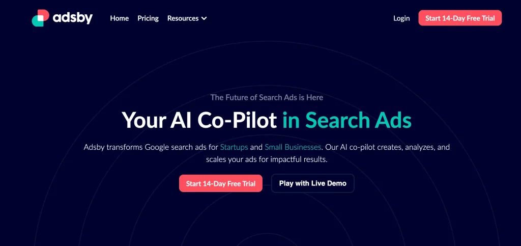
Adsby’s landing page demonstrates an effective CTA strategy:
- Color and Prominence: The “Start 14-Day Free Trial” button stands out due to its bright color against a dark background, making it the focal point.
- Immediate Value: The offer of a free trial reduces the perceived risk and incentivizes users to try the service.
- Secondary Option: The “Play with Live Demo” button provides an alternative for users who are not ready to commit but are interested in experiencing the platform’s capabilities.
- Clear Benefit: The headline communicates a powerful benefit, promising that Adsby will be an AI co-pilot in search ads, which resonates well with the target audience looking for streamlined ad management solutions.
These elements collectively make the CTA compelling, guiding potential customers to engage with Adsby’s services.
2. ClickUp’s Landing Page Call To Action Example
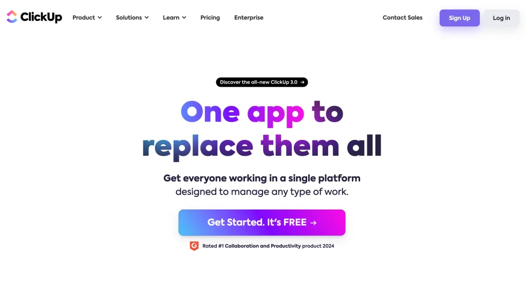
When it comes to crafting a landing page, the call to action (CTA) is not just a button or a link; it’s the tipping point between bounce and conversion. ClickUp’s landing page CTA exemplifies this principle through strategic design and psychology-driven copywriting. Let’s delve into why this particular CTA isn’t just functional but compellingly effective.
- Visibility and Contrast: The vibrant purple of the “Get Started. It’s FREE” button stands out against the lighter background, immediately drawing the eye.
- Clear Value Proposition: The text on the button promises a clear benefit — it’s not just free to get started, but the tool offers a comprehensive solution, aiming to replace multiple apps with one.
- Urgency and Incentive: By stating “It’s FREE,” it incentivizes immediate action without financial commitment, creating a low-friction entry point for new users.
- Authority and Trust: The badge indicating that ClickUp is “Rated #1 Collaboration and Productivity product 2024” establishes credibility and fosters trust, encouraging users to try the app.
- Action-Oriented Language: The directive “Get Started” is an excellent use of action-oriented language that encourages users to take the next step.
3. Gumroad – Call To Action Example
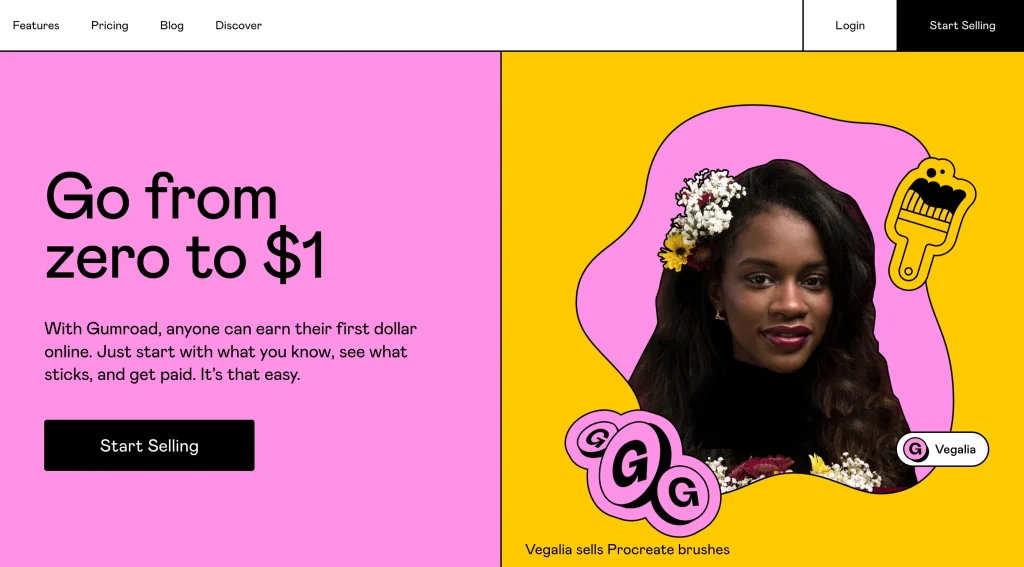
Gumroad’s website employs a CTA that is skillfully designed to both grab attention and motivate action:
- Striking Color Contrast: The CTA button “Start Selling” features a dark tone that sharply contrasts with the pink and yellow hues of the background, making it pop out for immediate visibility.
- Simplified Messaging: The message “Go from zero to $1” simplifies the concept of starting a business down to the most basic and attainable first goal – earning your first dollar, which can be very appealing for newcomers to e-commerce.
- Direct and Actionable Language: The wording “Start Selling” is a direct call to action that leaves no ambiguity about what the user is expected to do, tailored towards immediate engagement.
- Encouraging Tagline: The supporting text reassures the user that the process of selling online is easy and straightforward, which can reduce hesitation and encourage taking the first step.
- Social Proof: Featuring real person, adds an element of social proof and relatability, suggesting that real people have seen success with Gumroad, which can be very convincing.
- Brand Identity Reinforcement: The unique, artistic style of the imagery aligns with the creative audience Gumroad often caters to, reinforcing brand identity and appealing to the target demographic.
This CTA is not just about getting users to click a button; it’s about inviting them to start a journey with Gumroad, promising ease and potential profit right from the start.
4. Webflow CTA’s – Clarity of Action
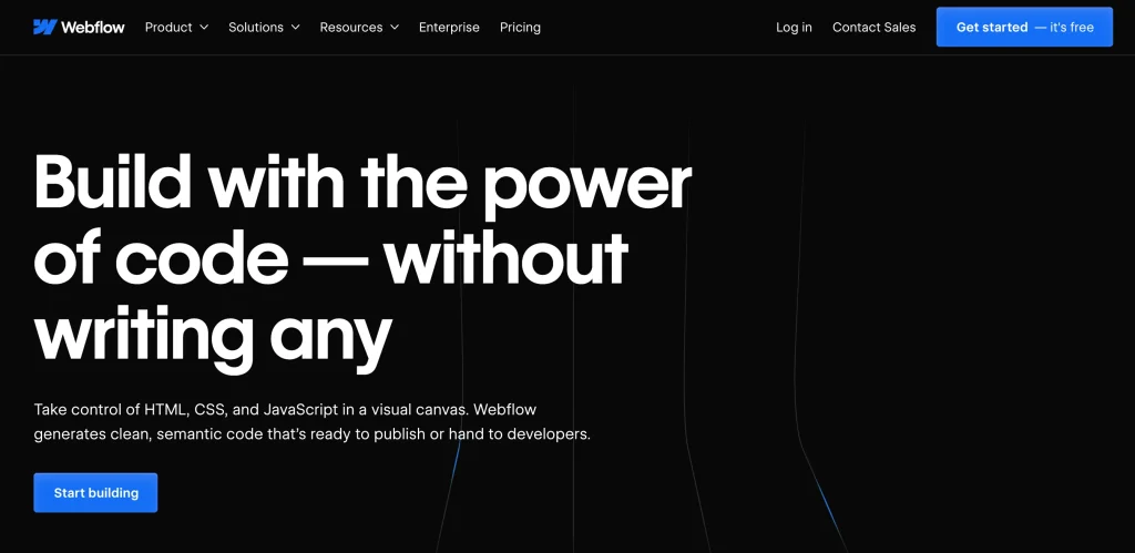
Webflow’s landing page features a CTA optimized for user engagement and conversion due to several key factors.
- Prominent Placement: The “Get started — it’s free” button is placed prominently above the fold, making it one of the first things a visitor sees without scrolling, which is a strategic placement for immediate attention.
- Contrast and Visibility: The CTA uses a bright blue color that stands out against the dark background, enhancing its visibility and drawing attention directly to the action Webflow wants the user to take.
- Encouraging and Direct Language: The phrase “Get started — it’s free” is simple yet effective. It suggests an easy beginning without any initial cost, reducing the perceived risk and encouraging users to begin using the service.
- Value Proposition: The header “Build with the power of code — without writing any” clearly conveys the value proposition, aligning perfectly with the CTA by offering a powerful incentive – the ability to create with code, minus the complexity.
- Secondary CTA: The secondary CTA, “Start building”, found under the main tagline, provides an alternative for users who are ready to dive deeper and complements the primary CTA without competing for attention.
- Visual Hierarchy: The design employs a clear visual hierarchy that leads the user’s eye from the headline to the subheadline, and finally to the CTA, creating a logical path to follow.
- Supportive Imagery: Although minimal, the graphic elements on the page support the messaging about simplicity and creativity, reinforcing the CTA’s intent.
5. Semrush – CTA Supported with Input Field
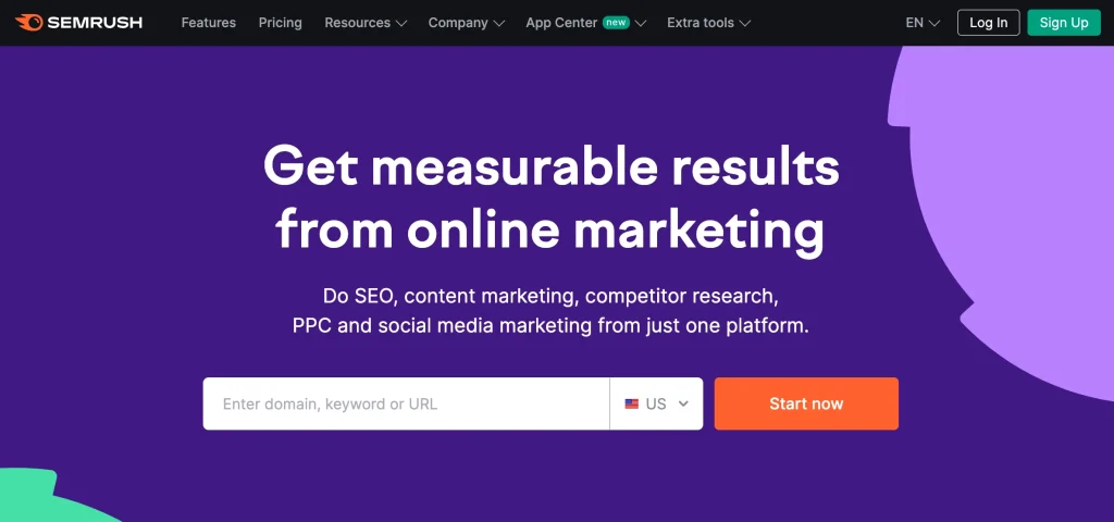
The CTA structure on SEMrush’s landing page is effectively designed for conversion and user engagement for the following reasons:
- Search Functionality: Including a search bar where users can enter a domain, keyword, or URL encourages interaction and offers a taste of the platform’s capabilities before committing.
- Eye-Catching Color: The vibrant orange “Start now” button stands out against the purple backdrop, making it immediately noticeable.
- Action-Driven Text: The “Start now” phrasing is clear and prompts immediate action, which can be especially effective for users with intent.
- Benefit-Oriented Headline: The header “Get measurable results from online marketing” directly addresses the user’s end goal, which is to achieve quantifiable success from their marketing efforts.
- Subheadline Support: The subheadline provides a brief explanation of the services offered, reinforcing the value proposition and setting expectations for what the platform delivers.
- Minimalist Design: The clean and uncluttered design focuses the user’s attention on the CTA, reducing distractions and decision fatigue.
6. Unbounce – Simple but Powerful CTA
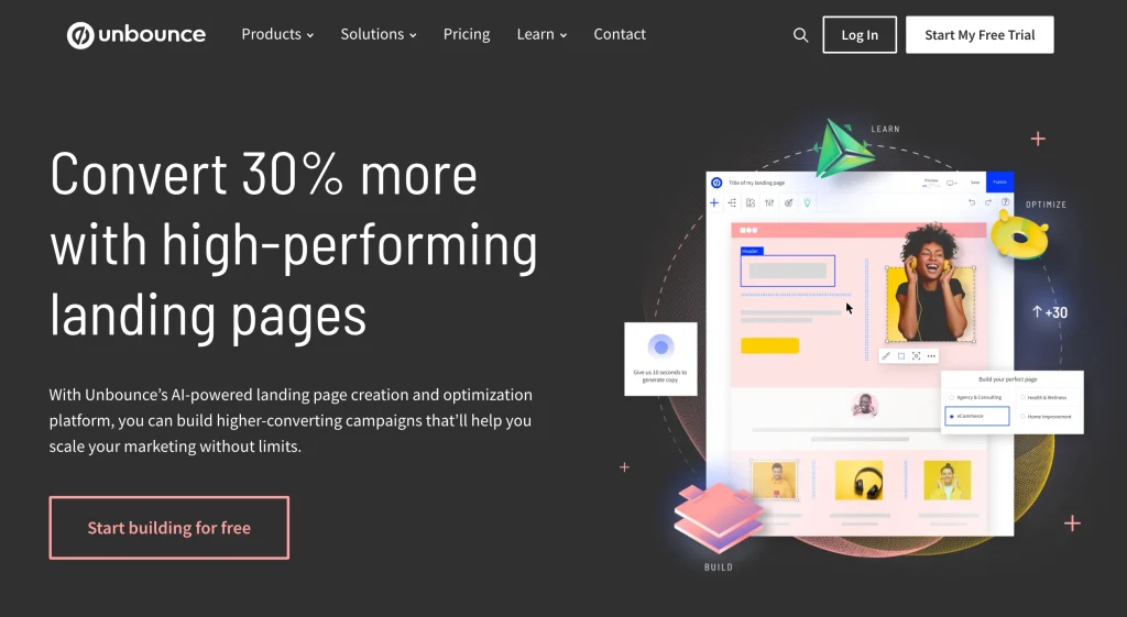
The CTA on Unbounce’s landing page stands out effectively for a few reasons:
- Strategic Color Use: The “Start building for free” button uses a contrasting color to the background, drawing the eye immediately.
- Compelling Value Proposition: The headline promises a significant improvement — “Convert 30% more with high-performing landing pages” — which directly addresses the primary goal of potential customers.
- Low Barrier to Entry: The offer to “Start building for free” eliminates financial barriers, inviting users to try the service with no initial cost.
- Supporting Imagery: The screenshot of the product in use gives visitors a glimpse of what they can create, helping to visualize the service’s value.
- Clear and Direct Copy: The button text “Start building for free” is actionable and straightforward, which is great for clarity and decisiveness.
The combination of these elements not only focuses the user’s attention on the CTA but also makes a strong case for clicking through, optimizing the landing page for conversions.
7. Calendly – Functional CTA Example
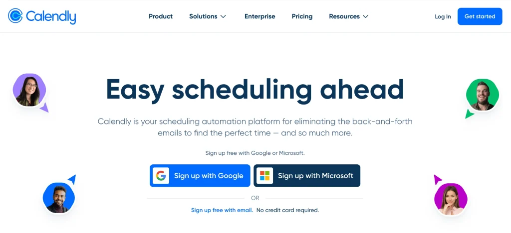
Calendly’s landing page showcases a CTA structure that is directly aligned with streamlining the user’s journey to registration. The focus on functionality is evident with options like “Sign up with Google” and “Sign up with Microsoft,” which facilitate an easy and swift sign-up process by integrating with existing user accounts. Additionally, offering a traditional sign-up method through email ensures that all user preferences are catered to.
This approach minimizes friction, offering a seamless transition from landing page to user onboarding. By providing familiar authentication methods, Calendly increases the likelihood of conversion, banking on the trust and ease of use associated with these platforms. The statement “No credit card required” further reduces potential hesitation, reassuring users that they can try the service without financial commitment.
These CTAs are not just buttons; they’re gateways designed for maximum conversion efficiency, built upon the premise of simplicity and trust in the user experience.
7 Call to Action Examples for Emails with High CTR
Emails are a powerful tool for businesses to connect with customers and drive conversions. However, simply sending out an email is not enough. You need to include a strong call to action (CTA) that encourages recipients to take the next step.
A well-crafted CTA can significantly increase your email click-through rate (CTR) and boost your bottom line. We will cover a variety of tactics, including creating a sense of urgency, using personalization, and offering value. We will also provide tips on how to optimize your CTAs for maximum impact.
By following the tips in this post, you can create CTAs that will encourage your recipients to take action and help you achieve your marketing goals.
1. The Urgency Trigger
Creating a sense of urgency in your email CTAs is a powerful way to drive click-through rates. This tactic capitalizes on scarcity and FOMO, urging subscribers to act swiftly to seize an offer. Here are several examples that demonstrate how to effectively use urgency in email marketing CTAs:
- “Last Chance: Save 20% before midnight!” – This CTA implies that the deal is almost over, which can push readers to take immediate action to benefit from the savings.
- “Hurry, only a few spots left for our webinar!” – By indicating limited availability, this CTA encourages recipients to register promptly.
- “Grab your exclusive member discount now! Offer ends in 3 hours.” – The countdown creates a race against time, making the offer feel more exclusive and desirable.
- “Flash Sale Alert: Get your dream items before they’re gone!” – This CTA not only suggests urgency but also hints at a high demand and limited stock, which can lead to a quick response.
- “Unlock Your Deal Today – This Special Invitation Expires Soon!” – Phrasing like ‘unlock’ and ‘special invitation’ adds a sense of value and timeliness to the CTA, making it more compelling.
2. The Curiosity Spark
Email CTAs, sparking curiosity, drive engagement by leveraging human curiosity to seek answers and resolutions. This approach teases content or offers, enticing readers to click and satisfy their curiosity. Here’s how to infuse curiosity into your CTAs, with some compelling examples:
- “See What You’re Missing Out On” – This CTA nudges recipients towards discovering something that others are already privy to, leveraging the FOMO effect.
- “Uncover the Secret to Success” – People are always looking to gain an edge, and the promise of a secret being revealed is hard to resist.
- “Find Out Why Top Marketers Swear by This” – Implies there’s insider knowledge to be gained, which can be very enticing to the curious mind.
- “Reveal Your Exclusive Surprise Inside!” – The promise of a personalized surprise creates excitement and a compelling reason to click.
- “Discover the 3 Tips Everyone Should Know” – Implies that there’s essential knowledge waiting just beyond the click, which most wouldn’t want to miss.
3. The Benefit Highlight
The focus is on clearly communicating what the subscriber will gain by taking action. This method aligns with the principle that people are more motivated to act when they see a direct benefit that addresses their needs or desires. Here are some examples that effectively bring the benefits to the forefront:
- “Boost Your Skills Today” – For an educational course, this CTA is clear and points directly to the personal growth aspect of the offer.
- “Get Smarter with Your Money Now” – Ideal for financial services or apps, this CTA promises a direct improvement in handling finances.
- “Transform Your Health This Week” – Health and wellness services can use such CTAs to highlight the personal benefits of their programs or products.
- “Upgrade Your Home Life” – Targeted towards home improvement or smart home products, this suggests a direct improvement in the subscriber’s daily living environment.
- “Revolutionize Your Workflow” – Tech tools or productivity apps could use this to imply a significant positive change in the user’s work life.
The aim is to make readers feel that clicking the CTA will bring an immediate and tangible improvement to their life or work. This is achieved through simple, direct, benefit-focused language, urging them to take action and experience the advantages firsthand.
4. Straightforward Approach
When crafting a Call to Action (CTA) for email marketing, taking a straightforward approach can be highly effective. It cuts through the noise and directly tells subscribers what action you want them to take. Here are several examples that illustrate the power of clear, direct language:
- “Buy Now” – The quintessential CTA for driving sales, it leaves no room for ambiguity.
- “Read More” – Perfect for when you’re sharing a snippet of a compelling article or blog post and want the reader to continue on your site.
- “Join Us” – This CTA is ideal for invitations to webinars, events, or community gatherings.
- “Give Feedback” – When seeking responses on a product or service, this CTA can encourage engagement.
- “Subscribe Today” – For newsletters or services, this is a straightforward request for commitment.
These CTAs work well because they are clear, concise, and tell the reader exactly what they will get by clicking. There’s no mystery, no fluff—just pure direction. This can be particularly effective when the value proposition is well understood or when dealing with time-sensitive offers. By employing a straightforward CTA, you can guide your subscribers towards taking the desired action with ease and efficiency.
5. The Personal Touch
Personalizing email CTAs can notably boost engagement by making the message feel customized to the individual reader. Here are several examples showcasing how to personalize your CTAs:
- “Claim Your Birthday Discount!”: Personalize the offer based on the subscriber’s birthday information, giving them a reason to engage and celebrate with a purchase.
- “John, Your Personalized Plan Awaits!”: Using the recipient’s first name in the CTA adds a layer of personal attention, suggesting a custom experience.
- “You’re Invited, [First Name]!”: An invitation becomes more compelling when it feels like it’s just for you.
- “Start Your Journey to Wellness” – Tie this CTA to content that the subscriber has shown interest in, like wellness articles or products.
- “We Miss You! Come Back for 10% Off” – Recognize the lapse in engagement and offer an incentive to return, which acknowledges the individual’s past interaction with your brand.
Personalized CTAs should leverage data insights like purchase history, user behavior, or demographic information to create a sense of individual care. When subscribers feel that an email speaks directly to them, they’re more likely to respond. These personalized CTAs are more than commands; they’re invitations to a tailored experience that feels exclusive to each subscriber.
6. The Challenge CTA
Creating a “Challenge CTA” in your emails can be an exciting way to engage and motivate your audience. By presenting a challenge, you’re tapping into people’s natural desire to achieve and participate. Here’s how to craft this type of CTA effectively:
- “Dare to Compare: Try Our Product for a Week” – Challenge your customers to use your product exclusively for a set period and see the difference for themselves.
- “30-Day Fitness Challenge: Are You In?” – Fitness services can engage users by challenging them to commit to a month-long program for potential results.
- “Can You Complete Our 5-Day Eco-Challenge?” – Eco-friendly brands can encourage customers to make sustainable choices and share their experiences.
- “Take the Quiz Challenge: Test Your Knowledge!” – This CTA can be used to engage users interactively, particularly if you’re in the education or content business.
- “Join the Savings Challenge and Cut Your Expenses in Half!” – Financial services can use this approach to encourage customers to try out their money management tools.
In these instances, the CTA not only prompts action but also sparks competitiveness, promising a feeling of achievement upon completion. By setting clear, attainable goals and possibly associating them with rewards, users are more likely to engage with your brand.
7. Testimonials Factor
Incorporating testimonials into your email marketing CTAs can significantly enhance their effectiveness by leveraging social proof. Here are several ways to seamlessly integrate testimonials into your CTAs:
- “Join Our Happy Customers” – Accompany this CTA with a brief quote from a satisfied customer to showcase the positive experiences others have had with your product or service.
- “See What Others Are Saying” – Use this CTA to link directly to a page full of customer testimonials. It’s an invitation to witness the acclaim your offerings have received first-hand.
- “Start Your Success Story” – Position a testimonial from a customer who has achieved notable success with your product or service right next to this CTA. It suggests that the reader could be the next success story.
- “Get Results Like [Customer Name]” – Personalize this CTA by including the name of a customer or a business that has benefited from your offering, followed by a quick, impactful quote or result metric.
- “Discover Why [Number] Customers Trust Us” – This CTA, coupled with a highlighted testimonial or a notable number of satisfied customers, emphasizes the trust and reliability of your product or service.
Integrating testimonials into your CTAs enhances credibility and fosters a connection with your audience, showcasing real-life value and customer satisfaction. This approach can make your CTAs more compelling and increase the likelihood of clicks and conversions.
7 CTA Examples to Boost Your Ad Conversion Rates
1. Google Ads CTAs: Use Urgency and Specificity
Google Ads, Google’s powerful advertising platform, allows businesses to display ads across Google’s vast network, including its search results, websites, and apps. The effectiveness of these ads often hinges on the Call-to-Action (CTA) employed, a critical element that prompts immediate response from the target audience. Utilizing urgency and specificity in CTAs can significantly enhance ad performance by encouraging quicker decision-making and clarifying the offer.
Urgency drives action by implying that the offer is time-sensitive, creating a fear of missing out (FOMO) among potential customers. Specificity, on the other hand, eliminates ambiguity, providing clear, direct instructions on what the viewer should expect upon clicking the ad.
Examples of Effective Google Ads CTAs:
- Urgency-Driven CTA: “Hurry, Sale Ends in 3 Hours! Shop Now.” This CTA creates a compelling reason for immediate action, leveraging the limited time frame to encourage a faster response.
- Specificity-Infused CTA: “Download Your Free E-book Today!” This straightforward CTA leaves no room for confusion about the action required and the immediate benefit of doing so.
- Combining Both Elements: “Claim Your 20% Off Coupon Before Midnight!” By merging both urgency and specificity, this CTA effectively communicates the benefit (a 20% discount) and the time-sensitive nature of the offer, maximizing the potential for immediate clicks and conversions.
Incorporating urgency and specificity into your Google Ads CTAs can dramatically improve your ad’s click-through and conversion rates. Tailoring your message to create an immediate need and providing clear instructions on how to satisfy that need ensures your audience knows exactly what action to take and why they shouldn’t delay.
Start your 14-day free trial now to harness the power of ai in Google Ads.
2. Facebook Ads Call to Actions Examples
Facebook Ads, a cornerstone of digital marketing, enable businesses to target a vast and diverse audience with precision. Converting this audience into customers hinges on the Call-to-Action (CTA) button, guiding users towards the next step, be it making a purchase, signing up for a newsletter, or learning more about a product or service.
CTAs in Facebook Ads are not just prompts; they are the bridge between interest and action. By choosing the right CTA, advertisers can significantly increase their ad’s conversion rate. Facebook offers a variety of CTA buttons tailored to different business goals, including “Shop Now,” “Sign Up,” “Learn More,” “Book Now,” and “Download.”
Effective Facebook Ads CTAs:
- “Shop Now”: Ideal for e-commerce, this CTA drives direct sales by encouraging users to start shopping immediately. Example: A clothing brand advertises a seasonal sale with the CTA “Shop Now” to direct users to their online store.
- “Learn More”: This CTA is perfect for introducing new products or services. It’s less about immediate conversion and more about providing information. Example: A tech company launches a new app and uses “Learn More” to guide users to a landing page with detailed information.
- “Sign Up”: Used for generating leads, this CTA aims to collect user information in exchange for newsletters, trials, or webinars. Example: A fitness platform offers a 14-day trial with the CTA “Sign Up” to capture potential customers’ details.
3. Instagram Ads CTAs: Highlight Aesthetics and Exclusivity
Instagram Ads, with their visually rich platform, offer a unique opportunity to engage audiences through compelling imagery and videos. Targeted Call-to-Actions (CTAs) can significantly boost ad effectiveness by capturing attention and motivating action. In this context, emphasizing aesthetics and exclusivity in your CTAs can be particularly effective.
Leveraging Aesthetics in CTAs
Your CTAs should seamlessly integrate with high-quality images or videos to maintain the platform’s aesthetic standards. For example, a fashion brand might use a visually striking image of their latest collection with a CTA like “Shop the Look” or “Explore New Arrivals”. This approach not only highlights the product but does so in a manner that’s native to Instagram’s visual nature.
Highlighting Exclusivity
Exclusivity can create a sense of urgency and desire among users. CTAs that suggest limited availability or exclusive access can drive higher engagement and conversions. A skincare brand might use “Get Exclusive Access” for a new product launch, suggesting that clicking the CTA is the key to unlocking something special and sought-after.
Instagram CTA Examples
“Swipe Up to Discover” – Commonly used in Instagram Stories, this CTA invites users to engage directly with a brand’s website or product page, offering a seamless transition from browsing to buying.
“Limited Time Offer” – This CTA creates urgency, prompting immediate action by emphasizing that the offer won’t last forever.
“Join Our Community” – For brands focusing on building a following, this CTA emphasizes exclusivity and belonging, appealing to users’ desire to be part of something special.
4. TikTok Ads Call to Action Examples
TikTok Ads have transformed how brands connect with audiences, leveraging the platform’s dynamic and creative nature. The key to unlocking this potential lies in crafting effective Calls-to-Action (CTAs) that resonate with TikTok’s highly engaged user base.
Embracing the Unique TikTok Experience
TikTok’s format supports short, captivating videos, making it crucial for CTAs to be as engaging as the content itself. Successful CTAs on TikTok often blend seamlessly with the video, encouraging viewers to interact without disrupting their viewing experience.
TikTok CTA Examples
“Join the Challenge” – Challenges are the heartbeat of TikTok. Brands can leverage this by inviting users to participate in branded challenges, creating a sense of community and engagement.
“Swipe Up to Learn More” – Used in TikTok’s In-Feed Ads, this CTA leverages the platform’s swipe functionality, making it easy for users to access more information about a product or service.
“Shop Now” – For e-commerce brands, a direct “Shop Now” CTA can be effective, especially when paired with compelling product demonstrations or testimonials.
Tailoring CTAs for TikTok
The key to effective CTAs on TikTok lies in their ability to feel native to the platform. This means using language and actions that resonate with the TikTok community. Incorporating music, trending hashtags, or popular TikTok phrases into your CTAs can significantly increase their appeal and effectiveness.
Understanding TikTok’s environment and adjusting CTAs accordingly enables brands to craft ads that not only grab attention but also foster meaningful engagement and conversions. This approach transforms TikTok CTAs into engaging invitations to join a vibrant community. This method makes TikTok CTAs engaging invitations to join a dynamic community.
5. Twitter (X) Ads CTAs: Promote Engagement and Conversation
Twitter Ads capitalize on the platform’s real-time communication, providing brands with a distinct chance to boost engagement and ignite conversations. Crafting effective CTAs is essential, motivating users to act while fostering interaction and discussion, aligning with Twitter’s dynamic nature.
Harnessing the Power of Conversation
Twitter’s environment is inherently interactive, making it an ideal platform for ads that aim to engage users directly. Twitter Ads CTAs should emphasize generating replies, retweets, and discussions, transforming each ad into a potential conversation starter.
Twitter CTA Examples
- “Join the Conversation” – This CTA explicitly invites users to engage with a topic, making it perfect for campaigns looking to increase visibility and foster community discussion.
- “Share Your Thoughts” – Encouraging users to share their opinions or experiences related to the ad content, this CTA leverages Twitter’s social interaction to amplify reach and engagement.
- “Vote Now” – For polls or surveys, a “Vote Now” CTA can drive interaction, with the added benefit of collecting valuable consumer insights.
Crafting Engaging CTAs for Twitter Ads
Successful CTAs on Twitter are concise, action-oriented, and tailored to spark engagement. Incorporating hashtags can also extend the conversation beyond direct interactions, tapping into broader discussions and trends on the platform. Additionally, posing questions or challenges within your CTAs can stimulate curiosity and drive more profound engagement.
By focusing on engagement and conversation, Twitter Ads can significantly enhance brand visibility and audience interaction. Well-crafted CTAs, tailored to Twitter’s social dynamics, can elevate ads beyond mere promotions, fostering conversation and community.
6. LinkedIn Ads CTA Examples
Linkedin Ads leverage the platform’s professional context to connect brands with a highly targeted audience of professionals and decision-makers. This platform focuses on career, networking, and professional content, ideal for B2B, recruitment, and educational ads. The Calls-to-Action (CTAs) in LinkedIn Ads, therefore, should speak to professional needs, aspirations, and the pursuit of industry knowledge.
Crafting Effective CTAs for LinkedIn Ads
The CTAs on Linkedin should be direct, clear, and professionally appealing, reflecting the platform’s business-oriented nature. They should encourage users to take actions that align with their professional interests or benefit their careers.
Linkedin Call to Action Examples
- “Learn More” – Ideal for ads offering whitepapers, case studies, or industry reports. This CTA attracts professionals looking to expand their knowledge in their field.
- “Apply Now” – Utilized in recruitment ads, this CTA directly encourages job seekers to apply for a position. It leverages LinkedIn’s significance as a platform for career advancement.
- “Sign Up for a Free Trial” – For software or service ads targeting businesses, this CTA provides a low-risk opportunity to experience the product. It appeals to companies aiming to enhance operations or productivity.
- “Join Our Webinar” – Inviting professionals to webinars can effectively engage them in industry conversations amidst digital learning and networking.
Tips for LinkedIn Ads CTAs
To maximize the impact of your LinkedIn Ads, ensure your CTAs are:
- Relevant to your target professional audience.
- Aligned with the ad’s value proposition, clearly stating what the user will gain by taking the desired action.
- Visually distinct within the ad, using buttons or standout text to catch the user’s attention.
7. Pinterest Ads CTAs: Encourage Exploration and Inspiration
Pinterest Ads, leveraging the platform’s visually-driven and inspirational nature, offer a unique opportunity for brands to connect with users actively seeking ideas and products. Calls-to-Action (CTAs) in Pinterest Ads play a crucial role in transitioning users from inspiration to action, making it essential to craft CTAs that resonate with Pinterest’s intent-driven audience.
Understanding Pinterest’s Unique Environment
Pinterest serves as a visual discovery engine where users pin ideas, products, and inspirations for future use. This forward-looking mindset makes Pinterest Ads particularly effective for driving long-term engagement and conversions. The right CTA in a Pinterest Ad can guide users from casual browsing to taking specific, meaningful actions.
CTA Examples on Pinterest
- “Make It Yours” – This CTA taps into the DIY and creative spirit of Pinterest users, encouraging them to engage with products that they can personalize or integrate into their projects.
- “Discover More” – For brands looking to drive traffic to their website or blog, this CTA invites users to delve deeper into their content, promoting exploration and extended engagement.
- “Shop the Look” – Utilized by fashion and home decor brands, this CTA directly links users to a page where they can purchase the featured items, making it easy for users to transition from inspiration to purchase.
Frequently Asked Questions About CTAs
Is a 1% Click-Through Rate (CTR) considered good for my ads?
A 1% CTR is generally considered the baseline for digital advertising, but “good” can vary greatly depending on the industry, platform, and ad format. For some contexts, especially in highly targeted campaigns or specific platforms like Google Search Ads, a higher CTR is expected.
Can achieving a 2% CTR be seen as successful?
Yes, a 2% CTR is often viewed as successful, indicating that your ad is resonating well with your target audience. It suggests that your CTA is effective and your ad content is engaging. However, industry benchmarks should be considered for a more accurate assessment.
How does a CTR of 0.5% measure up?
A CTR of 0.5% might be considered low for many digital ad campaigns, suggesting that there might be room for improvement in your ad’s design, targeting, or CTA. It’s crucial to analyze this in the context of your specific industry and the average CTRs for the platforms you’re using.
Q4: What strategies can improve my ad’s CTR?
To improve your ad’s CTR, focus on refining your targeting to reach a more relevant audience, use compelling and clear CTAs, optimize your ad’s design for visibility, and A/B test different messages and visuals to find what resonates best with your audience.
How important is the choice of words in a CTA?
A5: Extremely important. The choice of words in your CTA can significantly impact its effectiveness. Action-oriented, benefit-focused, and urgent language tends to drive higher engagement. Tailoring the language to your audience’s preferences and motivations can also make a big difference.