Are you aiming to enhance the performance of your landing pages and increase your conversions? The digital era has created numerous opportunities for businesses to design unique experiences for their prospects and generate more leads.
However, with the abundance of guides and strategies available for optimizing landing pages, determining the best approach for your business can be challenging. That’s where this guide comes in. So, without further ado, let’s delve into the essential guide to optimizing your landing pages for higher conversions.
According to research, business websites with 10-15 landing pages tend to increase conversions by 55% over business websites with less than 10 landing pages.
Table of contents
- What is a Landing Page Conversion Rate?
- What is a Good Landing Page Conversion Rate?
- Why Your Landing Page is not Converting?
- 10 Ways to Improve Landing Page Conversion Rates
- 1) Understanding the Role of Landing Pages in Conversions
- 2) Crafting Compelling Headlines
- 3) Utilizing Clear and Concise Copywriting
- 4) Designing for User Experience (UX)
- 5) Adding Social Proof and Trust Signals
- 6) Creating Strong Calls-to-Action (CTAs)
- 7 )Mobile Optimization
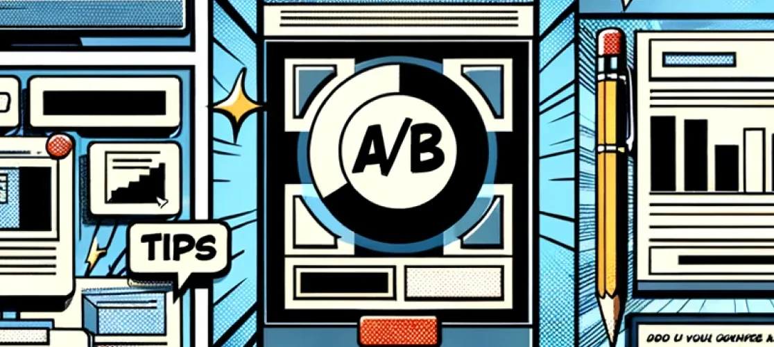
- 8) A/B Testing for Continuous Improvement
- 9) Leveraging Visuals and Multimedia
- 10) Speed and Performance Optimization
- Conclusion
What is a Landing Page Conversion Rate?
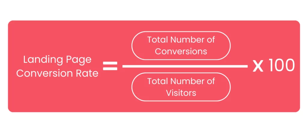
The landing page conversion rate indicates the percentage of visitors who complete a specific call to action on your website’s landing page, compared to the total number of visitors. This call to action could be anything from making a purchase, signing up for a newsletter, to downloading an eBook.
A high conversion rate implies that your landing page effectively convinces visitors to take the desired action. Conversely, a low conversion rate indicates that there may be issues with the message or design of your landing page.
So, how do you optimize the landing page and increase conversion rates? Let’s explore the process.
You can calculate the landing page conversion rate using the following formula:
This metric can be determined for various time frames, depending on your company’s reporting schedule, such as monthly or quarterly.
Luckily, you don’t need to manually perform these calculations; your website analytics tool should automatically handle this task. However, simply calculating your landing page’s conversion rate isn’t sufficient. It’s essential to compare it to industry benchmarks to determine whether you’re on the right track or need to make adjustments.
What is a Good Landing Page Conversion Rate?
Generally, a conversion rate of 10% is considered good for lead generation landing pages. Broadly speaking, achieving a conversion rate of over 10% can place you above the average.
According to a report by Unbounce, the top-performing landing pages can see conversion rates as high as 27.4%.
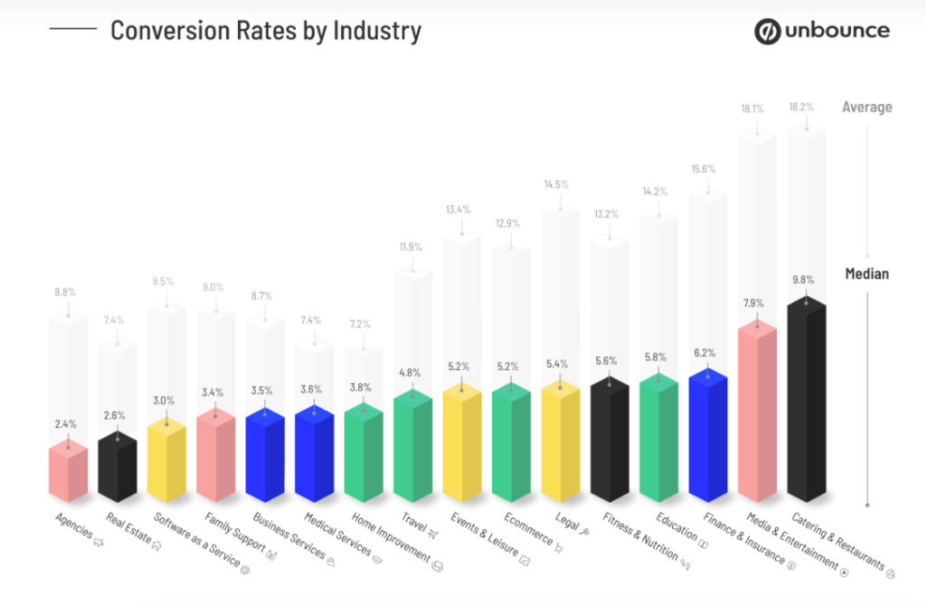
However, before making comparisons, it’s important to note that average conversion rates vary by industry. Comparing your rate to the overall average across all industries can give you a misleading impression of your performance. For example, conversion rates in the legal industry can differ significantly from those in e-commerce. Therefore, instead of asking, “What is a good landing page conversion rate?” you should ask, “What is the average landing page conversion rate by industry?” This will provide you with more accurate insights.
Here’s a lead generation landing page conversion rate graph from Unbounce:
Why Your Landing Page is not Converting?
There are several reasons why your landing page might not be converting effectively. Issues could range from a lack of urgency in your call to action, poor user experience, or an unappealing offer.
However, poor conversion rates are not a permanent fate. Read on to discover why your landing page isn’t converting and how to resolve each issue.
1. Your Landing Page Contains too Many Distractions
If your landing page is too busy with lots of words, pictures, or links, people might get confused and not know what to do. Make it simpler and focus on what you want them to do, like buy something or sign up.
2. You’re Reaching the Wrong Audience
Maybe the people seeing your page aren’t the right ones for your product. Make sure your ads and messages match the people you want to reach. Look at who’s visiting your page and change your ads to match them better.
3. Your Visitors Lack Trust in You
If your page doesn’t look trustworthy, with things like reviews or security badges, people won’t want to buy from you. Show them that other people like your product and that your website is safe.
4. There is Excessive Written Content
If there’s too much to read, people might get bored and leave. Keep it short and simple. Use headlines, lists, and pictures to make it easier to understand.
5. Your Message is Inconsistent with Your Ad
If your ad promises one thing, but your page talks about something else, people will feel tricked. Make sure your ad matches what’s on your page so people know they’re in the right place.
6. You Request too much Personal Information
If your form has too many questions, people won’t want to fill it out. Only ask for the most important information, like their name and email.
7. Your Call to Action Lacks Inspiration
If your button doesn’t make people want to click it, they won’t. Make it clear what you want them to do, like “Buy Now” or “Sign Up Today!”
8. The Landing Page Loads too Slowly
If your page takes too long to show up, people might leave before they see it. Make sure your page loads quickly by making pictures smaller and fixing any problems with it.
10 Ways to Improve Landing Page Conversion Rates
1) Understanding the Role of Landing Pages in Conversions
Landing pages are not just digital billboards; they are strategic touchpoints designed to guide visitors towards a specific action.
Instead of being a general webpage, it’s a focused destination crafted to encourage visitors to do something particular, like making a purchase, signing up for a service, or downloading content. Every element on the landing page is carefully chosen and arranged.
Knowing they can help turn visitors into customers shows how much they matter in your marketing plan. Everything on the page should be made very carefully to help with this goal.
2) Crafting Compelling Headlines
Every headline on a landing page serves a unique purpose, but there are some basic rules that apply to all of them. Here’s what you need to keep in mind when crafting your headline:
Rule 1: Make Sure It Fits Your Campaign Your headline should match the theme of your overall campaign. Visitors shouldn’t feel confused when they land on your page. Your headline should reflect your brand’s personality, especially for first-time visitors who may not know your brand well.
Rule 2: Keep It Clear and Direct Your headline should clearly communicate what your brand is about and how it can help visitors. Instead of trying to be clever, focus on being straightforward and getting your message across.
Rule 3: Get Inspiration You don’t always have to come up with a headline from scratch. Look at existing headlines for inspiration. A good formula to follow is to highlight the benefit or problem your brand solves, and then add a hook that promotes your unique selling point and encourages visitors to stay on your page.
3) Utilizing Clear and Concise Copywriting
Have you ever felt lost on a website because there was just too much information? That’s why clear and simple writing is crucial for a website to be easy to use. This is especially true for your landing page.
When the writing is clear and simple, it’s easier for people to understand what the product does, how it can help them, and what they need to do to get started. It makes things less confusing, so users can focus on the important benefits.
On the other hand, if the writing is confusing or too complicated, it can drive people away. It might make the product seem hard to use or understand, or even make people doubt if they can trust it. In a world where people have short attention spans and lots of choices, bad writing can really hurt your chances of success.
In short, clear and simple writing is super important for a good user experience. By keeping things simple, clear, and relevant on your landing page, you can make a great first impression, build trust, and get more people to use your product.
4) Designing for User Experience (UX)
Landing page UX design is about creating web pages that turn visitors into customers. They’re the final destination of online marketing campaigns, guiding users with clear messages and easy navigation. By prioritizing their design, you can increase the chances of converting visitors into customers. To make effective landing pages, follow best practices for user experience.
Key design elements that enhance user experience:
- Keep It Simple: Don’t overload your page with too much stuff. Clear and clean designs work best.
- Understand Your Audience: Think about who will visit your page and what they need. Design with them in mind.
- Don’t Ask for Too Much Info: Make forms easy to fill out. Only ask for what you really need.
- Make Your Call-to-Action Stand Out: Use strong and clear messages to guide users to take action.
- Use Relevant Visuals: Pictures and videos can help, but only if they make sense and support your message.
- Pay Attention to Your Words: Write clear headlines and use bullet points to highlight key info. Avoid using confusing jargon.
- Make Your Design User-Friendly: Ensure your page looks professional and is easy to navigate. Avoid confusing design tricks.
- Speed Matters: Faster loading times mean more conversions. Compress images and use tools to improve load times.
- Be Mobile-Friendly: Make sure your page looks good on phones and tablets. Test it on different browsers.
- Use Heatmaps to Understand User Behavior: Track where users click and scroll to improve your page.
- Testing: Try different things to see what works best. Use tools to get feedback from real users.
5) Adding Social Proof and Trust Signals
Trust is super important when trying to convince people to buy something. Share stories from happy customers, good reviews, and examples of how your product helped people. Show symbols that prove your website is safe and trusted, like badges and seals. Also, mention if your business has been recommended by important people or groups. These things make visitors feel confident in what you offer and less worried about buying from you. Talking about how your customers succeed and who you work with can make people trust you even more.
6) Creating Strong Calls-to-Action (CTAs)
A Call to Action Button is a clickable link or button on a website that prompts visitors to do something specific, like signing up for a trial, buying a product, or downloading a sample.
In marketing, a Call to Action (CTA) is essential for getting visitors to take actions that lead to sales. Without a clear CTA, visitors might leave without doing anything.
Using a strong CTA button on your website is crucial because it directs visitors on what to do next. It’s often overlooked, but it can greatly impact your sales.
To create an effective CTA button, you first need to know your goal and understand your audience. This helps you tailor your message to what your visitors want.
Here are some tips for creating effective CTAs:
- Make sure your CTA matches the purpose of your landing page.
- Use bold colors for your CTA button to make it stand out.
- Keep your wording simple and easy to understand.
- Use a clickable design for your CTA button.
- Make sure your CTA button is mobile-friendly.
- Place your CTA button where visitors are most likely to see it.
- Make sure your CTA leads to the right page or action.
- Create a sense of urgency in your CTA to encourage action.
- Consider adding supporting text to your CTA button.
- Use first-person language to make your CTA more personal.
7 )Mobile Optimization
With a significant portion of web traffic coming from mobile devices, optimizing your landing page for mobile is no longer optional. Ensure that your page loads quickly on mobile, the layout adapts to various screen sizes, and that buttons and links are easily clickable on smaller screens. A mobile-friendly design can prevent potential conversions from slipping through the cracks.
8) A/B Testing for Continuous Improvement
A/B testing is like a science experiment for your website or landing page. It helps you figure out what changes you can make to improve how well your page works. Here’s a deeper dive into each step:
1. Setting Clear Goals
Start by deciding what you want to achieve with your landing page. Do you want more people to buy something, sign up for your newsletter, or click on a specific link? Setting clear goals helps you focus your A/B tests on what matters most.
2. Creating Two Versions
Once you know your goal, make two versions of your landing page. These versions should be identical except for one specific change you want to test. For example, you might try different colors for your call-to-action button or rearrange the layout slightly.
3. Splitting Traffic
When you’re ready to test, randomly send half of your website visitors to one version of the page and the other half to the second version. This randomization helps ensure that your results aren’t influenced by factors like time of day or where your visitors are coming from.
4. Tracking Key Metrics
Keep a close eye on important metrics like how far people scroll down the page, how many of them take the action you want (like signing up or making a purchase), or how many clicks you get on certain links. This data will help you see which version of your page is performing better.
5. Analyzing the Data
Once you’ve collected enough data, analyze it to see which version of your landing page is the winner. Look for patterns or trends that can help you understand why one version might be outperforming the other.
6. Implementing the Winning Design
Once you’ve declared a winner, make that version of your landing page the default for all visitors. This ensures that everyone gets to see the version that’s been proven to work best.
7. Continuous Testing and Iteration
A/B testing is an ongoing process. Keep testing different variations of your landing page and making small tweaks based on what you learn. This iterative approach allows you to continually improve your page and achieve better results over time.
By following these steps and continuously refining your landing page based on data-driven insights, you can create a more effective and engaging experience for your website visitors.
9) Leveraging Visuals and Multimedia
Visual content can significantly enhance the appeal and effectiveness of your landing page. High-quality images, videos, and infographics can illustrate your message more vividly than text alone. Ensure that visuals complement the copy and aid in conveying your value proposition succinctly and memorably.
10) Speed and Performance Optimization
In the digital age, speed is crucial. Slow-loading pages can frustrate visitors and lead to high bounce rates. Optimize your landing page’s performance by compressing images, leveraging browser caching, and minimizing the use of heavy scripts. A fast-loading page keeps visitors engaged and reduces the likelihood of them abandoning your site.
Conclusion
Optimizing your landing page is an ongoing process that requires a keen understanding of your audience and a commitment to testing and refinement. By implementing these proven strategies, you can create landing pages that not only attract visitors but also convert them into loyal customers. Remember, every element on your page should work harmoniously to guide the visitor towards the desired action, turning your landing page into a powerful conversion tool.